

Ask an Interior Designer
House-whisperer Lithe Sebesta on the mistakes people make — starting with mine.

Anyone will tell you that working with an interior designer is an intimate process. That was especially so in my case: Lithe Sebesta and I have been friends since 2002. She’s had the keys to every place I’ve lived since, and knows all of my design and living…quirks. So to say that this apartment wouldn’t have been possible without her eye is an understatement. (Not to mention her ability to put together a team and help me navigate a co-op board.)
Over the years, she’s shifted from being a writer to a designer because the homes that she’s renovated and flipped, whether in New York, Paris or Hudson, were just too good. Even an upstate rental she spent a few months personalizing felt more complete than the weekend house I’d been in for over a decade, prompting my ex to describe her as having “the spatial equivalent of perfect timing.” So in 2013, when Amanda Hesser asked if I knew someone who could upgrade her home without the expense of a real renovation, I recommended Lithe. (As did Rita Konig.) Working through word of mouth, she’s gone on to create homes for friends and clients, as well as to design an Orange County polo club and a Hudson café, for which she also made much of the furniture. (That’s her daybed, below. She also makes these lamps with a textile designer.) Give or take a light fixture or two, her projects share no common design elements. Rather, they are a true expression of the owner, not the designer.
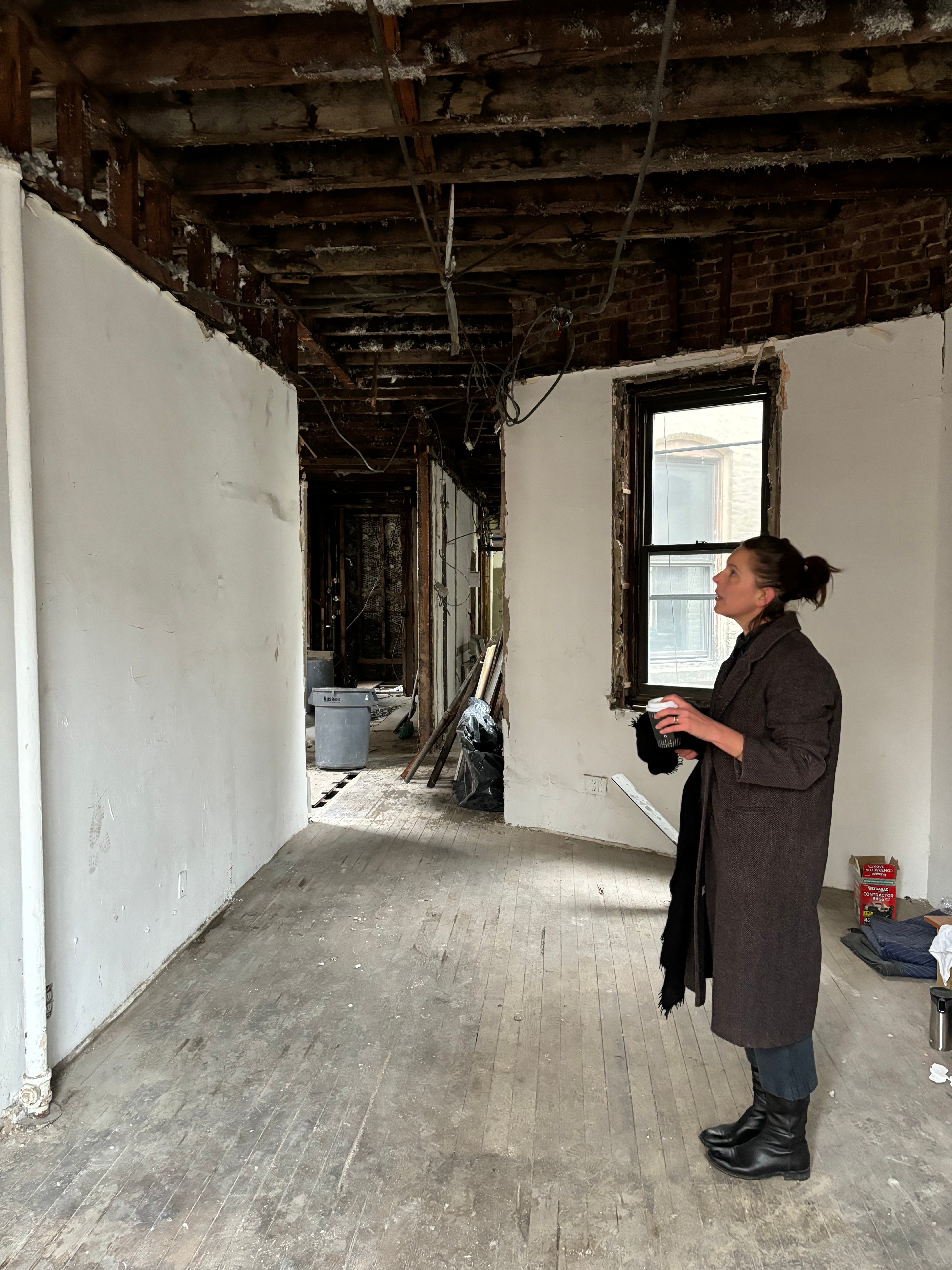
Lithe trying to convince me to tear it down and build a better one. (I didn’t. She was right.)
A couple of my favorite Lithe hacks for this place: When figuring out where the dining area should be, she created a “room” out of dead space, building a hexagonal dropped ceiling trimmed with elegant stepped molding and, just below, running the floorboards on the diagonal to further offset the space. (See it here.) And she carved an office out of my son’s room, then added a few more inches to be able to fit a custom daybed that can sleep a friend on the $100 Amazon mattress, covered in Knoll fabric. (Source below.) The two other plywood pieces that she designed — a kitchen banquette and a massive bookshelf — were brilliantly and affordably made by Summerhill Fabrication, which usually designs temporary pieces for galleries and fashion shows: another great Lithe find.
Was it stupid to work with a close friend on a two-year gut reno? It got dark a few times, but I prioritized the decades of friendship over, say, the jaw-dropping number of outlets. (Apparently NY law.) Also, having relied on her advice for several moves, from which way the bed should face to a decent mattress under $400, I knew that I should just cool it and listen. She put up with my frugality and my insistence on symmetry — and egg-shaped doorknobs — while gleefully making this minimalist-on-paper uncomfortable about her deepest secret: hoarding. (Mostly shopping bags. But only sentimental ones…) Through her writer’s ability to shape a narrative, her editor’s ability to find just the right piece and her therapist’s ability to get to the heart of a personality, she made this apartment even more beautiful than I could have imagined. Every day, my son and I say, “I can’t believe we get to live here.”
And whenever she’s zipping through New York on her way to projects throughout New England, I hope she’ll spend the night. She’ll always have the keys.
I couldn’t help but interview her for this renovation series — and not just about this project. She has lots of great advice, especially in the speed round at the end.
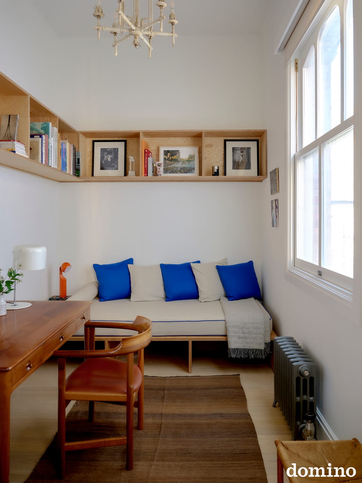
The office/guest pod. Daybed fabric: Knoll Crossroad in Cinnamon. Chiarastella Cattana Raso 121 in Blu Spazio. Photograph by Belle Morizio for Domino. Styling by Naomi DeMañana. Art Direction by Linda Denahan.
What did you initially see as the biggest challenges — besides getting my head around the budget — and what did the biggest challenges turn out to be? Were the latter typical of the projects you’ve worked on?
Initially, my biggest challenge was finding the right team to work with. (As you may recall, we met with eight contractors, and found two standouts; Andrew Giancola was the one who was willing and able to tackle the five flights of stairs!) Any creative, complicated renovation requires sane, reasonable collaborators, who are no-fuss, no-drama, and take the endless whack-a-mole of issues in stride.
The biggest challenge ended up being the endless negotiations with building management, which in New York is sadly common. (And Reform, but you won’t include this in this Q and A!) [Sure I will!]
How did you translate my disparate ideas/dreams into a cohesive vision?
Actually, it’s a long-seasoned marriage of a mildly uptight French person and a bon vivant Scandinavian (extra friendly after a couple of skols), but you already know that couple. They have a cute NYC kid called Max who likes to talk about architectural colors.
More seriously, I have a friend who starts her design work with character description—the person she is making the space for. I work differently: I’m interested in the character of the person or people in front of me, and the place they actually live in. You had a number of influences: 19th-century Parisian, John Pawson, early modernists, late punk. The building is a tenement from the early 20th century.
Ultimately, I tried to listen, and to strip it down to the things that I thought were actually essential. Light was critical, and if not light, then color. Discreetly beautiful materials. You have an interesting eye but hear the noise-chatter of too many things very quickly, so it was important to find the moments of visual pause.
At one point, you told me that the apartment was going to be “very buttoned-up.” How did you accomplish that?
Buttoned-up to me means fitted, like a glove. You presented a challenge of strictness: nothing wasted, nothing lost. (You love beauty, you hate waste.) We worked our way through more complicated solutions to arrive at a simpler, more elegant result. Which meant even though we were thoughtful about budget, everything needed to be customized to be essential. Even the Reform units, which were tricked out beyond their usual capacity—or, frankly, what they were willing to advise on—in order to get the maximum value from the space.
What are your favorite details?
I love how we created a feeling of openness with special details that unfurl, starting with the very tiny but precise mosaic tile entry, to the light and tight kitchen/storage wall, to the dining room with the careful molded ceiling, extracted (sneakily) from images you shared, and in homage to the surprisingly handsome elements of New York’s early tenement buildings. And I’m happy with how we found practical solutions that weren’t visually distracting—a skinny shelf by the entry for keys, sculptural hooks, an expanding laundry rack line, a shelf unit designed to hold your record player and art books.
I also love how the fireplace turned out—something you really drove as essential. The dense inkiness of the salvage slate mantel brings an unexpected amount of gravitas to the center of the room.


What were your best hacks and budget finds?
Making a more interesting surface out of Max’s bathroom by color-blocking with 4x4 Zia Tile—and then finding a Corian remnant top (in this case, through my local hardware store in Hudson and training it down over my arm like a handbag). We also repurposed a leftover Reform door for the vanity front.
Using inexpensive but perfectly elegant and functional solar shades from Blindsgalore, and then designing wood valances that were integrated into the sills as they built the casings—to make them appear like more complicated architectural solutions than they are. I love draperies if they are dramatic, but otherwise would be glad if they disappeared.
What mistakes did I make, and how common are they?
It’s an interesting moment in design and building in general, where everyone is confronted with a continuous illusion of perfection. The possibilities of AI/design technology/design media make everything seem as instantly achievable as a time-lapse IG reel, while the practical realities of physically making things, in the physical world, haven’t changed in a substantive way.
Making physical objects is hard! Having the ‘idea’ is only the beginning; it’s marrying the idea to the realities of how-to-actually-make-it, whether it’s a drawing that communicates, or materials that are available, or a skilled fabricator who is willing to work with you...
So everyone makes mistakes, including professionals. The biggest mistake is not keeping an open mind—as a client or as a designer—and leaving room for inevitable mistakes to become discoveries: moments you would not have chosen but feel right. The human-centered piece of built objects needs to accommodate the difference between a render and standing in a room, with light and air and color and weight.
I think you initially wanted a very different layout, something much grander, and you weren’t sure that the size of the bedrooms was going to work. We also initially assumed we were going to be able to enlarge the bathrooms. In the end, we had to listen to what the apartment could be, as much as what you wanted. So the only mistake was assuming that it could be anything different than it inevitably was! This is, as you can imagine, extremely common. My role is ultimately to guide back to the best version of the possible.
What’s the biggest piece of advice for someone considering a gut reno?
Prepare yourself for discovery, both positive and negative. Gut renovations are not for people with both budget constraints and inflexible attitudes. Make sure to have partners (designers, contractors, collaborators) who aren’t flustered by setbacks, and are committed to staying the course. It’s an opportunity to discover a great deal about your own process, including your tolerance for uncertainty!
You’re really good at making people’s spaces look like theirs, not another iteration of your style. How do you do that?
I came at this backwards, having worked as a writer (and even considered becoming a therapist), so I really do think relationally. I like discovering how people see things, or what their own memories are, or what resonates for them. It’s often surprising! I love using the limiter of a client or collaborator’s point of view—or the expanse of it. The process is super intimate and psychological in ways that nobody really wants to talk about. It’s the setup of a good embrace. That’s part of what makes a process go well. Even though this didn’t go that well at certain points, we made it through.
I also don’t personally find it interesting to do the same thing over and over again, though I certainly have solutions or materials that I have discovered and used repeatedly. (Ranging from exaggeratedly small round knobs to the pleasantly clinical Duravit vessel sink, to upholstered walls as headboard/space resolvers, and Baltic birch as a warm but clean material that behaves itself in almost any environment.)
My favorite spaces to be in are those where you are not truly aware that they are ‘designed’ by a third party. They don’t necessarily photograph well, but they feel wonderful; naturally resolved, like an inevitable expression of the owner and the space itself. I also encourage people to find things where they are: scraps and sentimental materials that can get incorporated in.
For someone on a budget, what are the most worthwhile investments?
Hardware—things you touch every day. Getting solid doorknobs and handles makes a subtly palpable difference. (Rather than pressed metal knobs. And solid wood rather than hollow-core doors.) Coordinating hardware finish throughout or in individual spaces—little details that you don’t register but make things feel purposeful and sing. Artwork—frame found objects, even prints or posters. And lighting—don’t blow your budget on a million recessed points of light. (The electrician costs more than the fixture!) You can spend the money on fewer, more carefully placed, more special lights. Also: custom upholstery is not that expensive, and is truly worth the pain. Throw pillows made from fabric you picked up while traveling? Headboard fitted to your wall? [True, these are some of my favorite moments in the apartment.]
The things they think they need to spend on but can actually skip?
I love the color development of brand-name paints, but I have yet to see that the paints themselves truly perform differently for the price on your average wall. (Some of the specialty finishes are a different matter.) So if it’s a standard wall or trim color, get it matched at Benjamin Moore or Sherwin Williams for half the price.
It’s obvious, and everyone does it now, but with furnishings especially, get vintage rather than West Elm/Article. (Though, I, too, love IKEA, but they have real designers!) If you ever want to get rid of it, new used things have next to no value, and something vintage will essentially hold a good portion of its value. (Taste permitting.) Don’t feel obliged to get something by a name; follow your nose and look for solid materials. Enjoy wear, otherwise known as patina.
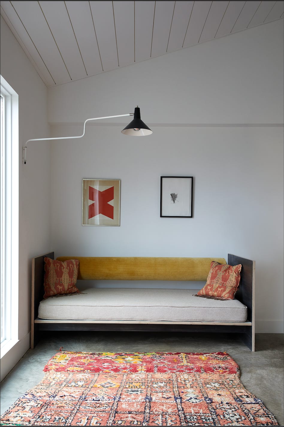
A daybed Lithe designed for her last home. Love the yellow velvet bolster.
Speed Round!
Favorite white paint color: Simply White
Daybed or sofa? Daybed
Best kitchen splurge: Pot filler
Best bathroom fixtures, low + high: Low, weirdly I’ve had good luck with Kingston Brass. High, I would go Parrin and Rowe.
Best auction house? Stair
Best Facebook Marketplace score? A folk cabinet for my house in Maine
Most clichéd piece of furniture right now? Camaleonda sofa by Mario Bellini
Most underrated design (era or piece): Handmade objects made without affection for current taste are the thing I feel is truest.
The one thing you can’t stop reordering for clients? Original BTC Minster 2 Prismatic Light
Go-to fabric: Knoll Crossroad: Looks like linen but is wipeable. Perennials does incredibly innovative solution-dyed acrylics that I put in any situation that needs small children or old drinkers. Or dogs.
lithe! hollow core doors are a war crime.
True collaborators!! What an inspiration ❤️